Web Design
Crypto, Web3, FinTech
Building a Calm, Premium, Privacy-Led Brand in a Noisy Web3 Market

Client:
Bilexer
Industry:
Web3 / Blockchain / Cryptography
Work areas:
Branding, Visual Identity, Web Design, UX/UI
Year:
2025
We created the full branding and website for Bilexer — a crypto startup developing a new architecture of privacy-first digital identity powered by zero-knowledge cryptography. The core focus was a standout visual identity built around Web3 audience preferences: premium aesthetics, minimalism, trust, and technological clarity.
Create a brand and website that clearly differentiates the startup in the Web3 space and builds trust around a highly technical product.
The Web3 ecosystem is saturated with visually similar projects: dark interfaces, neon accents, overly “futuristic” aesthetics. Bilexer introduces a fundamentally new type of digital identity based on ZK-cryptography, and the challenge was to:
visually stand out from typical Web3 design patterns,
instantly communicate trust and privacy,
present a complex technology in a simple and emotionally engaging way,
deliver a premium user experience that appeals to a modern crypto audience.
The branding needed to reflect security, privacy, minimalism, and technological maturity — while avoiding the overused “crypto hype” aesthetic.
Key Branding Elements:
The “Soft Tech” Aesthetic
Soft noise gradients and digital landscape textures symbolize the fluidity and privacy of a personal identity layer. They form an atmospheric, calm, protective visual environment.
Contrasted Typography
A combination of elegant italics and strict grotesque creates a premium, intelligent visual tone. The brand voice becomes: confident, private, technologically refined.
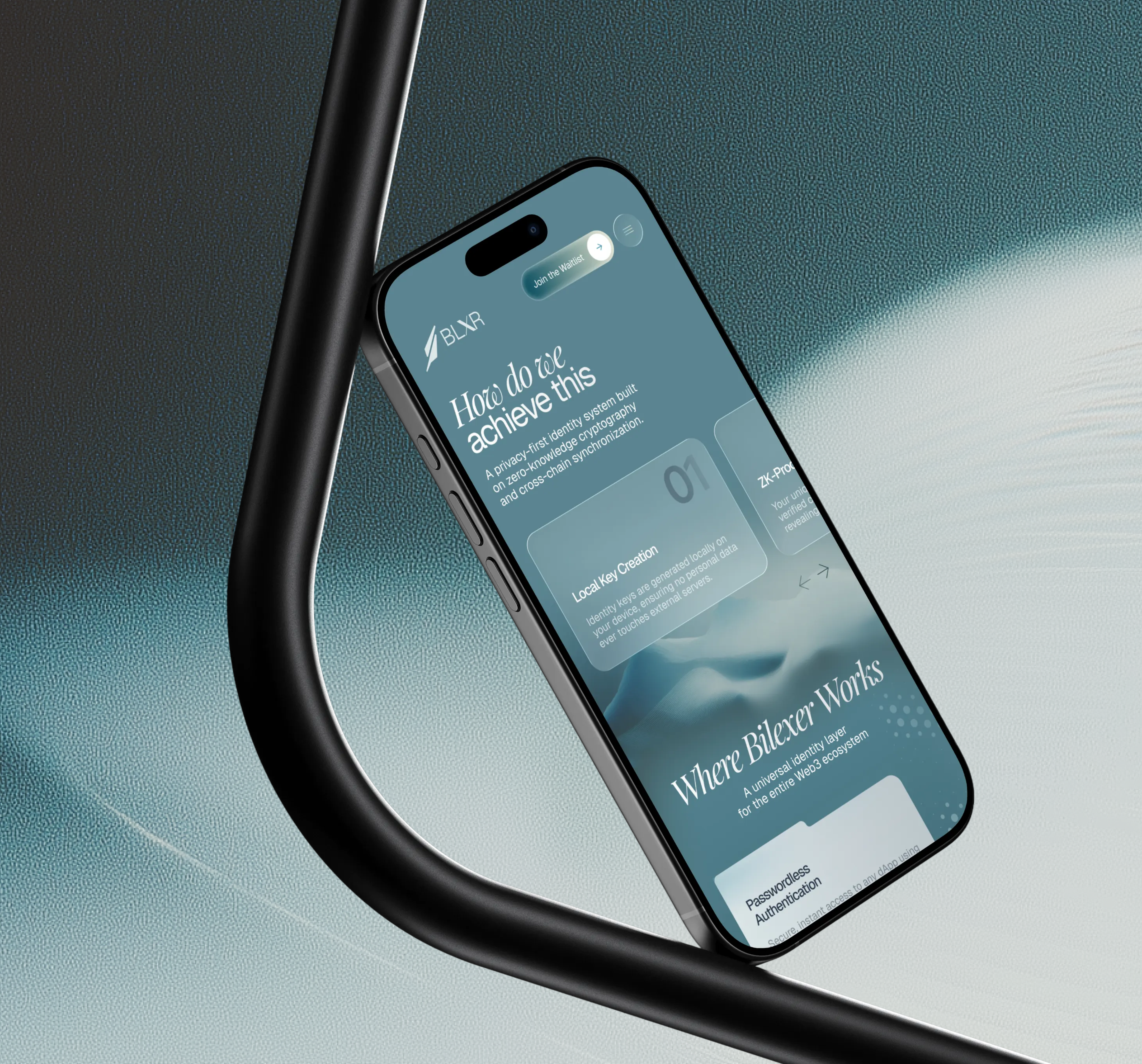
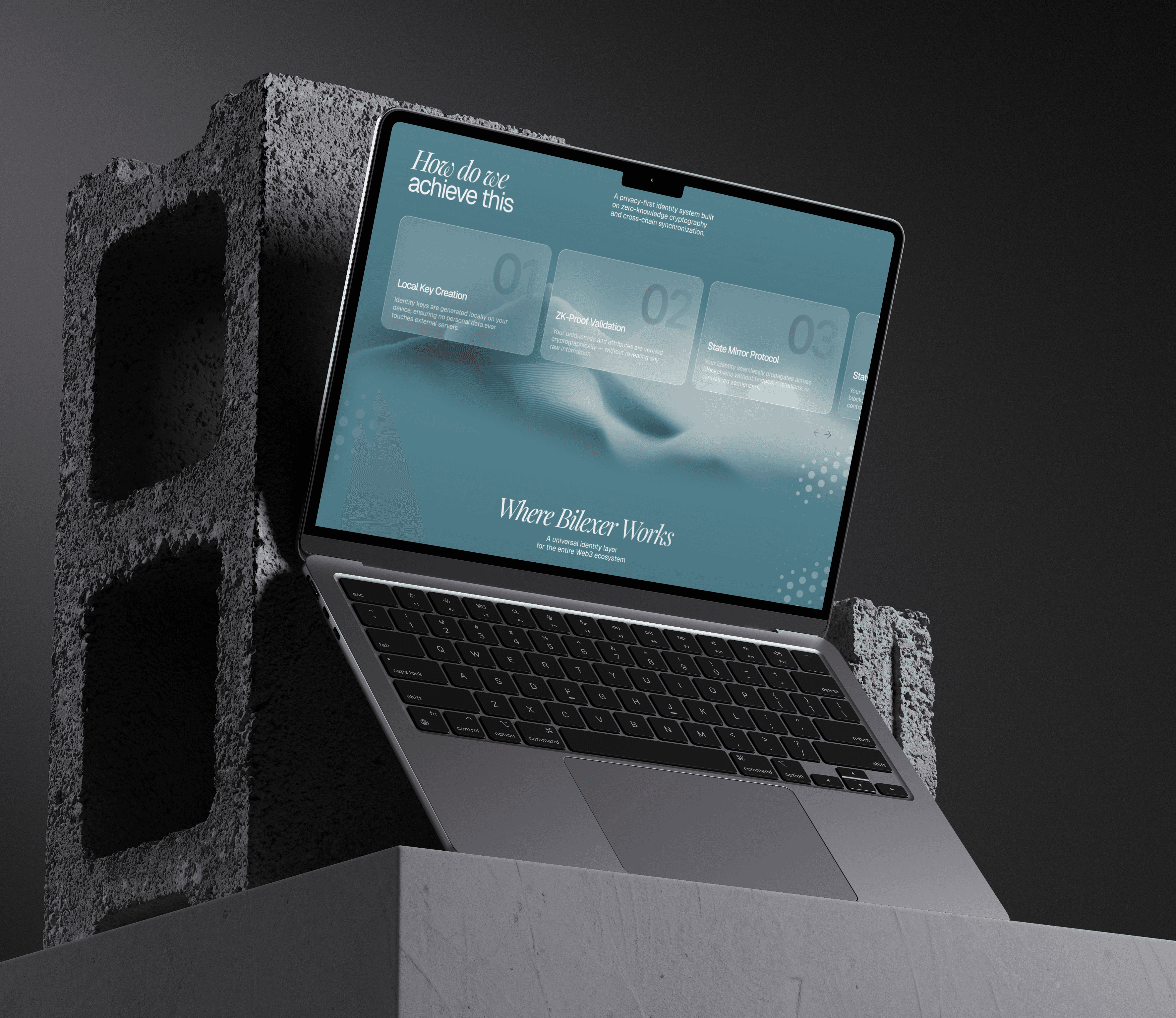
“Glass Folders” — a Signature UI Pattern
Translucent folder-like cards serve as a metaphor for private user data. This instantly differentiates Bilexer from any Web3 competitor and establishes a recognizable visual signature.
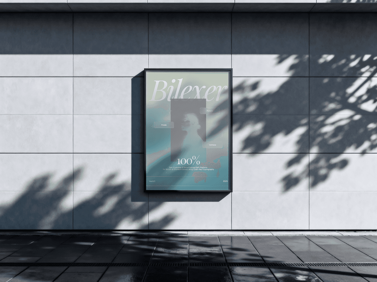
A Color Palette Built on Trust and Privacy
Foggy teal and soft greenish gradients create a sense of safety, calmness, and premium stability. No neon, no noise — just mature confidence.
Audience-Centric Design Logic:
Web3 users value privacy, clarity, and lean interfaces.
The identity was built on key behavioral insights:
Privacy should be felt, not just stated.
Visual calmness creates more trust than aggressive “crypto visuals”.
Users decide in the first 3 seconds whether a product feels safe.
Process — Our Workflow
Step 1 — Research:
We analyzed the Web3 landscape, 20+ leading competitors, audience behavior, and visual trends to uncover the gap between complex technology and immature design standards.
Step 2 — Concept Development:
We created 3 brand directions; the team selected “Soft Tech” as the one that best reflects privacy, clarity, and modern crypto aesthetics.
Step 3 — Visual Identity:
Typography, color system, graphic patterns, UI modules, motion language, and signature metaphors.
Step 4 — Website Design:
A hero section as a brand manifesto
“Glass folder” structure for content
A clean narrative around complex ZK-technology
Premium minimalism to increase trust
Step 5 — Animations & Microinteractions:
Light, subtle, privacy-led animations that support the overall mood.
Key Solutions
A complete departure from standard Web3 graphics.
A unique, ownable visual pattern with “glass folders.”
Digital landscapes as a metaphor for identity depth.
Simplified visual explanations of zero-knowledge technology.
Premium minimalism designed specifically for privacy-driven users.
Results
A fully unique, recognizable visual language unlike any competitor.
The brand elevated Bilexer as a mature, premium, privacy-driven product.
The identity became a strong communication asset for investor relations.
The website significantly increased waitlist engagement (client reported a 2× stronger CTR).
Complex technology became intuitive thanks to visual metaphors and structured storytelling.