Brand Identity Design
Bakery, B2C
Building brand identity for a bakery in a surf-town of Portugal

Client:
Quint'æssencia
Industry:
Bakery / Food / Gastro
Work areas:
Branding, Visual Identity, Web Design
Year:
2025
We created the complete brand identity for Quint'æssencia—a slow-concept bakery on a peninsula in Portugal. From naming to visual system, we built a language that captures craft, freedom, and a bit of funkiness. The result feels as intentional as their fermentation process!
Create a brand identity for an artisanal bakery that breaks free from typical craft bakery aesthetics.
The artisanal bakery space follows predictable visual patterns: rustic textures, wheat illustrations, earthy neutrals, nostalgic typography. Quint'æssencia takes a slow, thoughtful approach to baking but needed an identity that felt anything but predictable. The challenge was to:
stand out from conventional craft bakery branding, incorporate identity of the owners
communicate quality and intentionality without feeling precious,
balance artisanal craft with contemporary energy,
create a system that works across packaging, digital presence, and physical space.
The branding needed to reflect bold flavours, warmth, and creative confidence—while avoiding traditional bakery aesthetics.
The goal: signal innovation and surprise while staying warm and inviting.
Key Branding Elements:
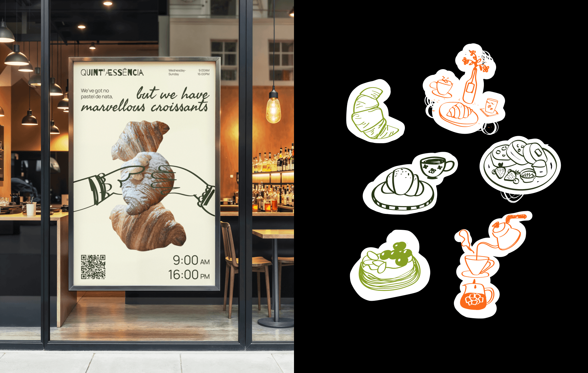
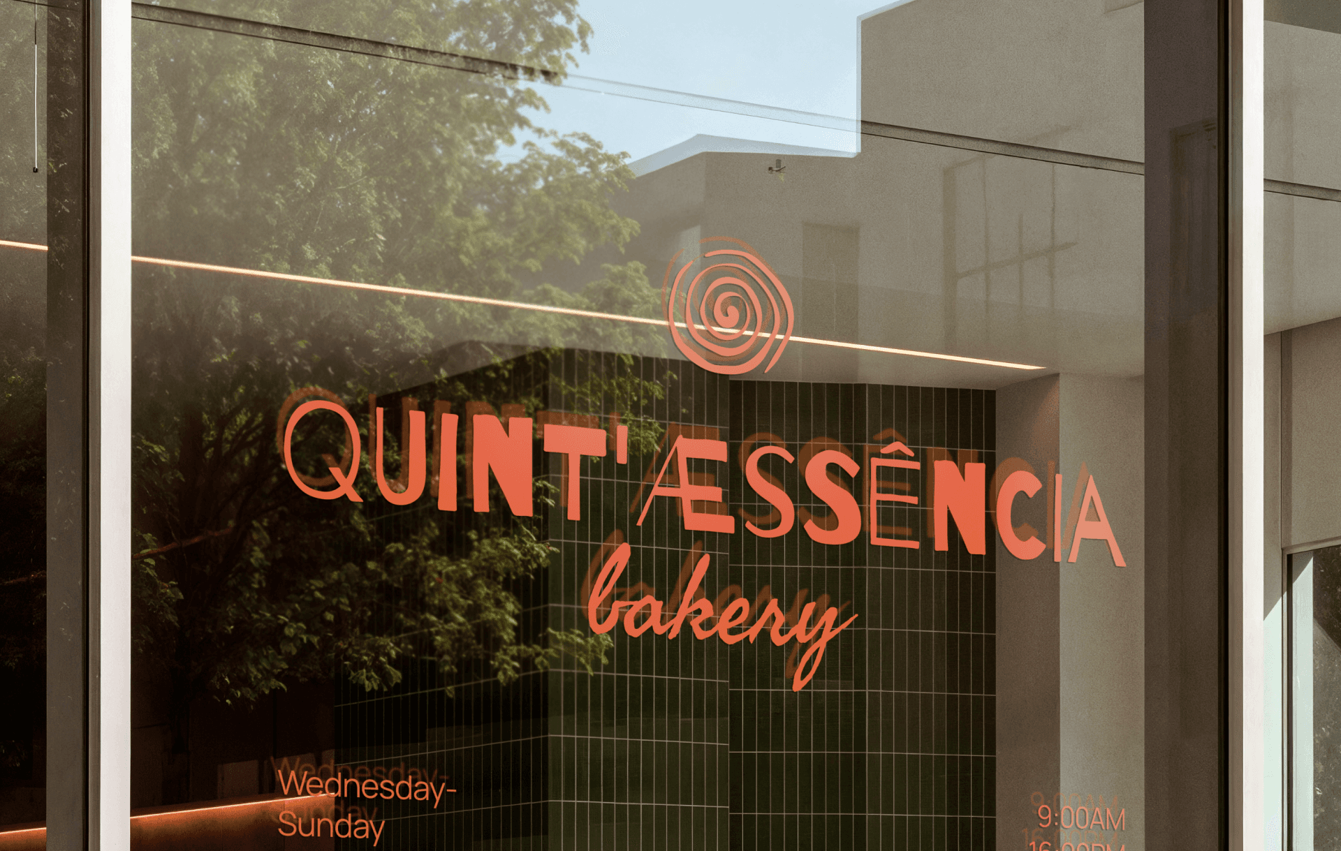
The Spiral Logo — Craft Meets Energy
The concentric spiral symbolizes the layered process of pastry-making: fermentation, patience, and transformation. It references both the natural patterns in sourdough and the continuous journey of craft. The warm orange color adds energy and approachability, distinguishing the brand from traditional bakery earth tones.
Vibrant Color Palette as Flavor Language
Bold oranges, greens, and yellows represent the unexpected flavor combinations Quint'æssencia is known for. The palette moves away from predictable bakery beiges and browns, signaling creativity and surprise while maintaining warmth. Each color suggests a different flavor profile—citrus, herbs, sunshine.
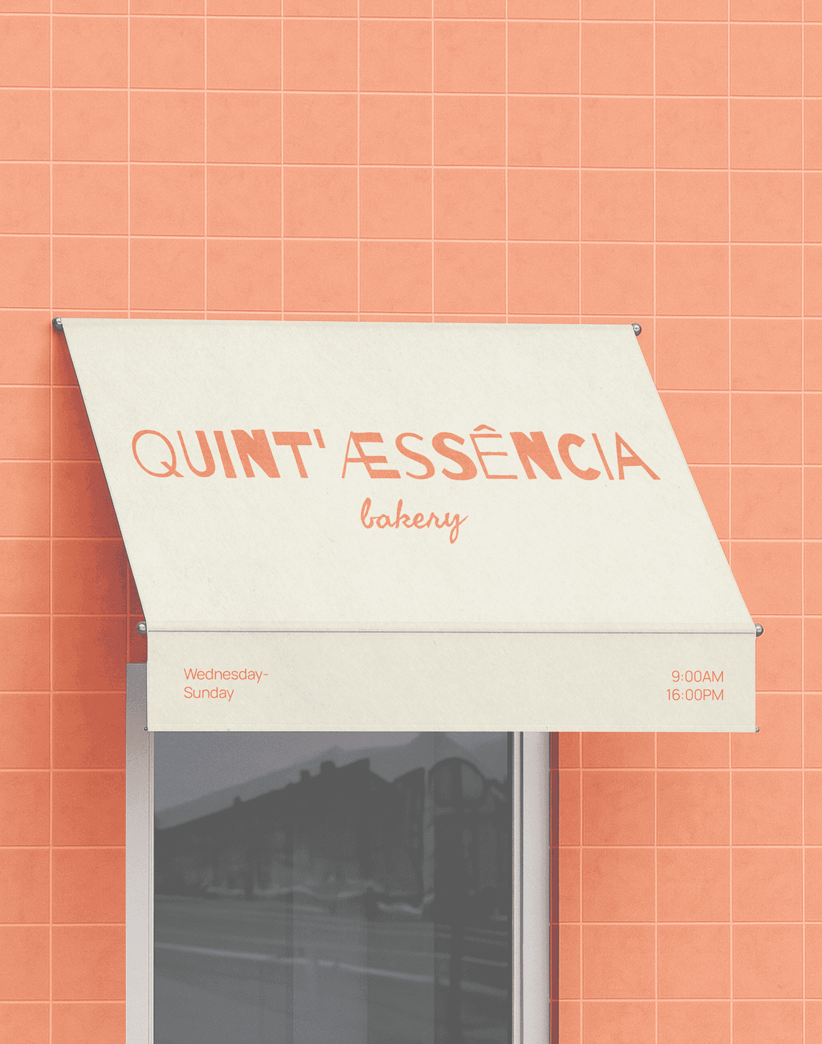
Playful Typography with Italic Accents
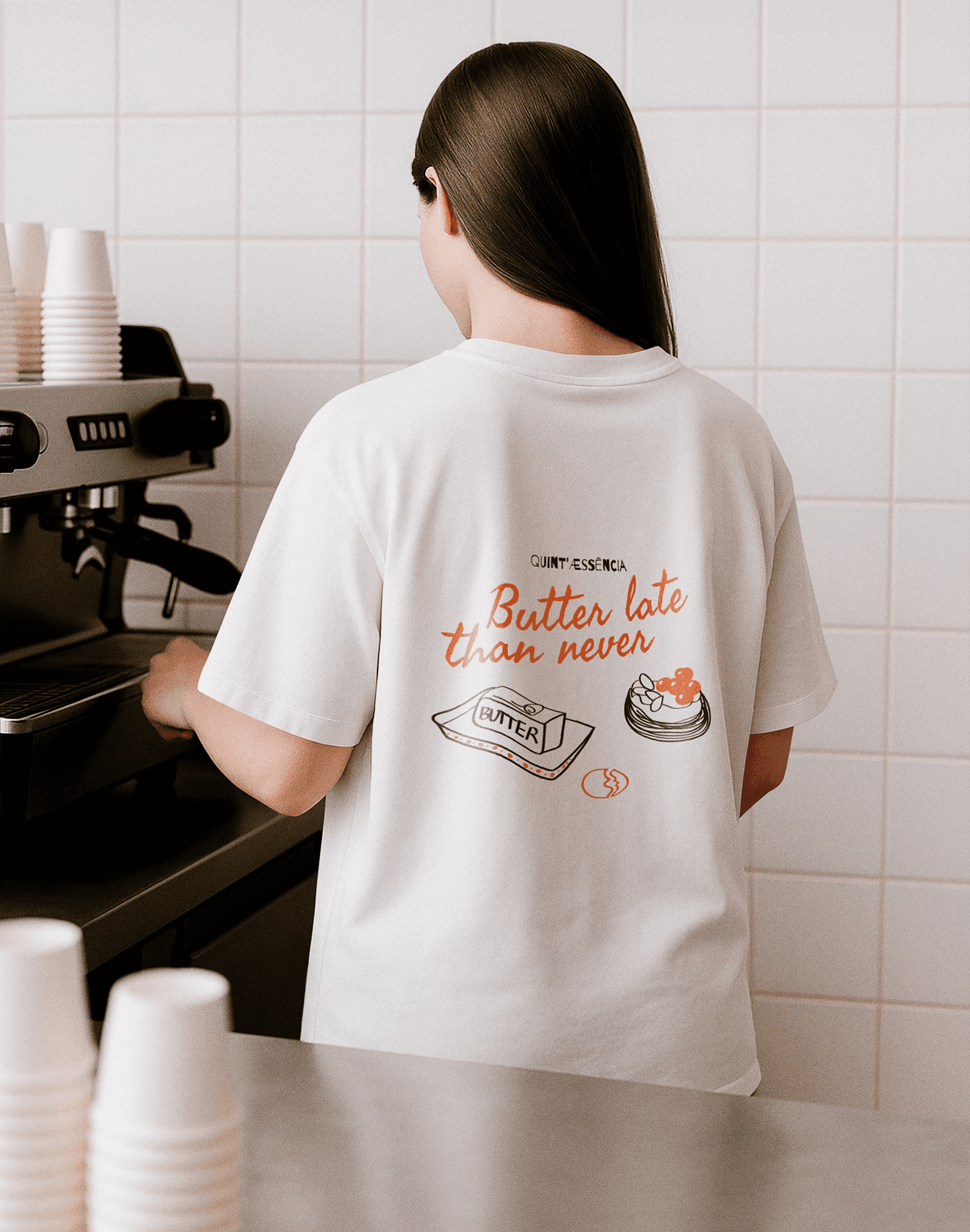
The contrast between clean sans-serif and handwritten italic script ("neighborhood," "Quinta") creates personality without sacrificing legibility. The italics add a human, personal touch—emphasizing the handmade, heart-filled aspect of the bakery. The main wordmark's quirky accent marks (æ, ê) hint at the unexpected without being gimmicky.
Illustrated Food Icons — Whimsical but Purposeful
Simple line drawings of pastries, drinks, and ingredients add a lighthearted, sketch-like quality. These illustrations feel spontaneous and playful, reinforcing the brand's approachable personality while maintaining a cohesive visual system across all touchpoints.
Quint'æssencia is an artisanal bakery located in Peniche, Portugal—one of Europe's most iconic surf hotspots.
In a town where most pastries and breads are mass-produced and treated like fast food, this bakery stands as a quiet rebellion. Here, classic international pastries are crafted slowly, intentionally, and with respect for technique.
QA embraces seasonality and creativity, often selling out before noon. Each week brings new flavours inspired by the multicultural duo Polina and Carlos, whose international background shapes the bakery's unique identity.
The purpose of the branding was to capture the soul of Quint'æssencia and translate it into a visual language that feels unmistakably theirs. The identity needed to reflect a free-spirited bakery breaking the norms of its town, the playful and funky personality of the owners and their "baby" bakery, the boldness of their flavours and unexpected combinations, and the feeling of a neighbourhood café where you know your barista, share stories, and always try the weekly experimental pastry.
Process — Our Workflow
Step 1 — Discovery & Research
We studied the local bakery landscape in Peniche, analyzed artisanal bakery competitors across Portugal and Europe, and identified visual clichés to avoid. We mapped out the target audience—locals, surfers, tourists seeking authenticity—and explored how to communicate craft without falling into predictable rustic aesthetics.
Step 2 — Naming & Positioning
We developed the name "Quint'æssencia" (quintessence + essence), referencing the five elements and the core philosophy of distilling flavours to their purest form. The positioning: a neighbourhood bakery that breaks norms through creativity and international influence.
Step 3 — Visual Identity Development
We created the spiral logo system, vibrant colour palette inspired by flavours, and playful typography mixing clean sans-serif with handwritten italics. The system needed flexibility for seasonal products, packaging, physical space, and digital presence.
Step 4 — Brand Applications
Logo lockups for signage, packaging, and loyalty cards
Illustrated food icons for menu boards and social media
Website design with warm photography and playful copy
Physical touchpoints: storefront signage, packaging, interior graphics
Step 5 — Launch Materials
Mini landing page, menu design, social media templates, and print collateral. Everything designed to feel spontaneous and warm while maintaining brand consistency across all customer touchpoints.
Key Solutions
A complete departure from traditional bakery aesthetics—no wheat stalks, kraft paper, or vintage nostalgia.
A vibrant, ownable color system that represents bold flavours and unexpected combinations.
The spiral logo as a metaphor for layered craft, patience, and the natural fermentation process.
Playful illustrations and handwritten touches that communicate warmth without sacrificing contemporary appeal.
A flexible brand system that balances artisanal credibility with funky, approachable personality.
Results
A distinctive visual identity that stands apart from traditional bakery branding in the region.
The brand successfully communicates craft and creativity, attracting both locals and international visitors.
Strong social media presence with highly shareable content—vibrant visuals that stop the scroll.
The playful yet premium aesthetic helped position QA as a destination bakery, not just a neighborhood shop.
Flexible brand system that easily adapts to seasonal products, special collaborations, and evolving offerings.